
11
Brand Audits: Measuring What Matters
A brand audit is a rigorous examination of all of your brewery’s internal and external communications going back to your earliest days. This includes any existing positioning and brand strategy work, like print (packaging, tap handles, merch), digital (website, social media, email), events (parties, beer releases, tap takeovers), relationships, news and earned media.
Are there any other major visual cues or key signifiers that are core to your brand? Common examples can include:
- A logo build or composition (e.g. New Belgium’s cruiser bicycle or Sierra Nevada’s scroll and pasture scene)
- A specific icon (e.g. KettleHouse’s yellow “K”)
- SKU-specific colors
- Illustrations & illustration styles (e.g. Flying Dog’s Ralph Steadman label artwork)
- Typography (e.g. Dogfish Head’s iconic typeface)
- Packaging composition (color on bottom, style on top, etc.)
- Format (16-ounce cans, bottles, four-packs, etc.)
Another important element to weigh is any existing intellectual property, such as:
- Existing trademarks for your brewery name, fanciful beer names, event names, logos and typography
- Protected trade dress (a form of intellectual property that refers to the visual characteristics of your identity or packaging)
Once gathered, we’ve found that interpreting this stuff is largely a common sense endeavor. Have you used the same logo (or some variation thereof) for several years? Does your logo adorn tin tackers and neon signs throughout your market? If so, you might consider retaining some element of it through the rebrand. Is your IPA the best-selling craft beer in your state? Then you might consider keeping the same packaging color or other key signifiers through the update.
To help our clients feel more confident in their brand equity decisions, we take them through a “Recall Exercise.” This works particularly well when we have access to customers. And best of all, it’s cheap and easy. We’ll tackle this in the workbook, but here’s a brief rundown.
Print out several blank cans or bottles and spread them around your taproom along with markers. Challenge your patrons to draw your logo and packaging from memory (honor system). If you’re brave enough, this can also be done at beer festivals, though you’re likely to net much worse, sloppy results. We’ve found that the most basic elements people draw (colors, logo elements, typography placement on packaging, etc.) are often the key pieces you should consider retaining through a rebrand because they’re the things people look for when buying your beer.
Can you rebrand and keep the same logo?
This question comes up a lot and is usually tied to the aforementioned concern of confusing customers. “We’ve had the same logo for 6 years, there’s no way we can change it now!” Here are a few things to consider.
It’s unlikely that your original logo is going to make it through a rebranding process while remaining an accurate representation of your brewery. This is because you will be refining and deepening your core messaging, defining your brand essence, and revamping your overall visual system and packaging. At the end of this process, your original logo is far more likely to stick out like a sore thumb on otherwise slick new packaging.
If your mark was never designed by a professional designer in the first place (or, in some cases, even if it was), the logo itself might not be good. I don’t mean to sound like a design snob, but there can be very real issues with typography, illustration style, hierarchy and basic visual communication that can have a negative impact on your brand.
As with everything, brand strategy and equity should dictate this decision. If you determine that you should maintain a similar look (more of a refresh), at the very least the mark should be updated to fall in line with the rest of your new look.
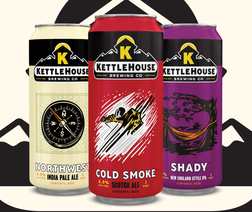
KettleHouse Brewing (Missoula, Montana) had been using essentially the same logo for 23 years. And they were using the same packaging (with slight tweaks as the years went by) since the first can rolled off their line in 2006. Our brand audit found that many of these elements were sacrosanct—there was no way we could substantially change their logo and packaging without confusing (and angering) people and losing a significant amount of brand equity.
Given this, we carried out a subtle update across the board. The logo design entailed decluttering their mark, reining in the number of typefaces and improving legibility.
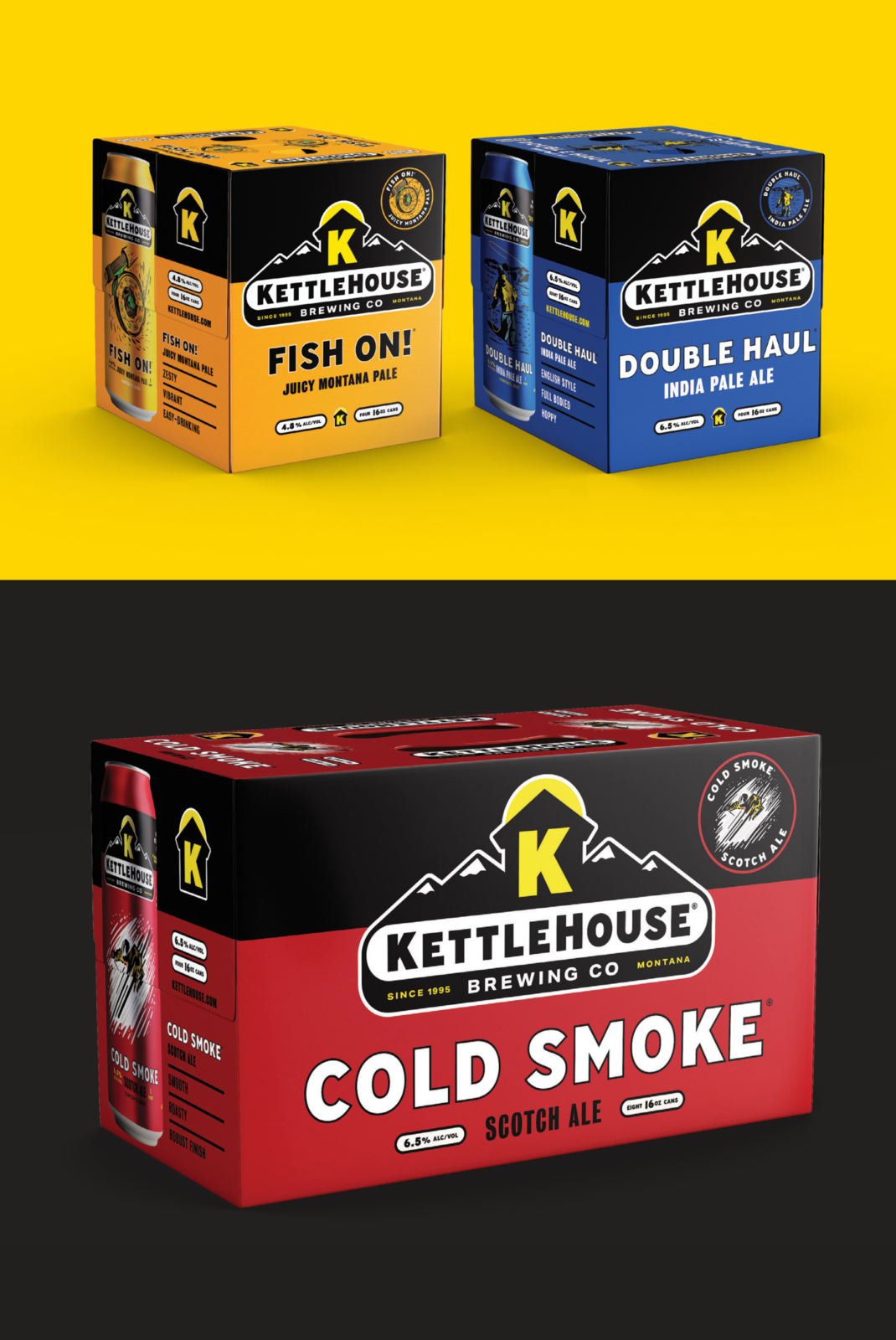
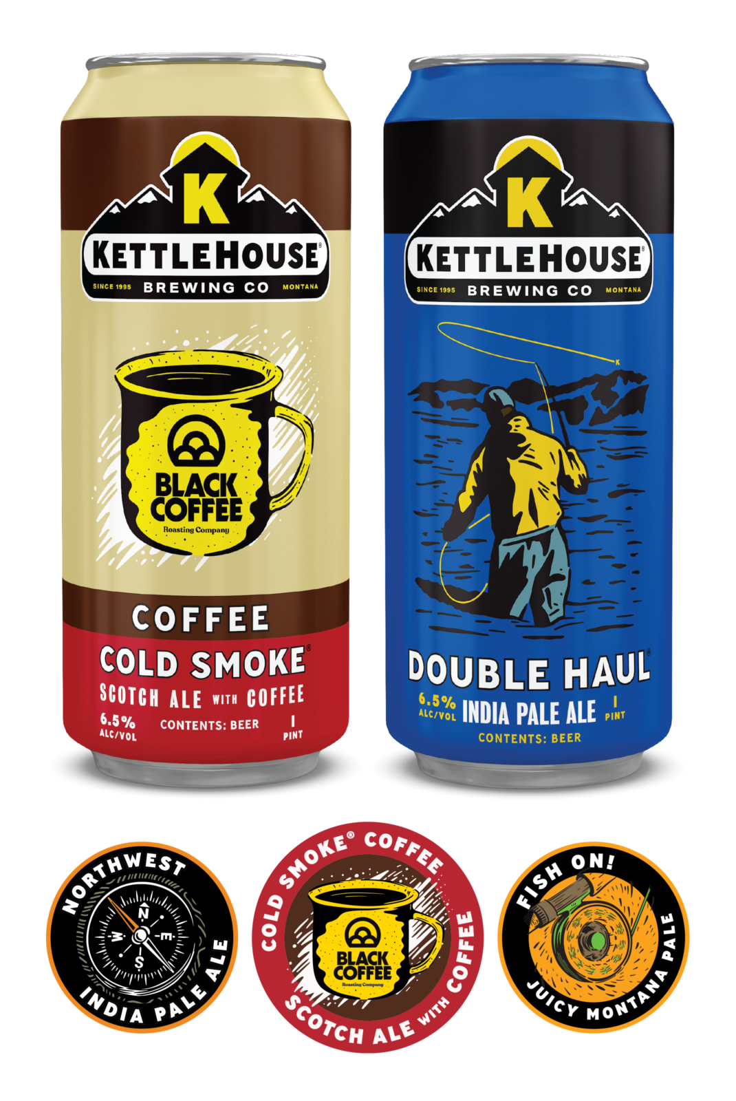
We extended this approach to their packaging as well with updated illustrations and a consistent layout so that the logo, description, government warning and illustrations were all on the same place on every single can and box.