


01
Starting with a Shared Vocabulary
We’re going to use a lot of industry lingo throughout this book (don’t sweat it though, this stuff isn’t rocket science). To get the most out of this book, it will help to have a shared vocabulary as we work through everything. So, let’s define a few terms and discuss why they’re important to our endeavor.
Your brand is your customers’ perception of your company, including your products and your culture. It’s their gut feeling about what you do and ultimately shapes why they either love or hate you. Why do they think you’re different? How do they describe you to friends? Why do they, or don’t they, support you?
Your customers’ perceptions are the result of your messaging and brand voice—how you communicate who you are and what you’re about. These manifest through many touch points, but most importantly through your brand identity.
Your brand identity is the visual language you use to tell your story. This includes your logo (aka “mark”) and icon system, color palette, typography and image styling. It can extend to your packaging system and website as well, but generally refers to things dealing with your core logo system.
Brand essence is a distillation of the most compelling idea behind your brewery. It’s mostly an internal tool used to capture the spirit of your brewery rather than a public facing statement or tagline. Think of it as a way of driving every decision you make during the rebranding process from the moment you define it. If you can get specific and granular on this idea now, it will make all branding work downstream more consistent and clear.
Touch points are all the interactions you have with your customers. This includes physical touch points like your packaging, merch and sales material and digital touch points like your website and social media channels.
Positioning is the strategic act of defining your brewery’s core concept, main customers, and how you’re different from your competition. It’s defining a “space” in the market you can own that no one else can touch or lay claim to.
Rebranding represents a shift in your core messaging. This can include refocusing your positioning and brand essence and manifests in a new name (optional) and an updated look and feel, starting with your core logo, packaging, website and extending to all your touch points.
A brand refresh is more of an update—call it a fresh coat of paint. Your core brand values and positioning still hold true, but your brand identity may be showing its age. Maybe your beer isn’t selling as well as it used to. Do your marketing materials and other communications seem a bit tired? Often, problems like these can be solved with a refresh—an updated identity and packaging that builds on what you currently have.
The difference between a full rebrand and a refresh can seem semantic. If you feel like you need to make substantial changes—your brewery’s name, messaging and positioning along with your visuals (identity and packaging), then you’re looking at a rebrand. If you’re simply tweaking some of the elements of your brand identity but maintaining the same general theme, you’re refreshing your brand.
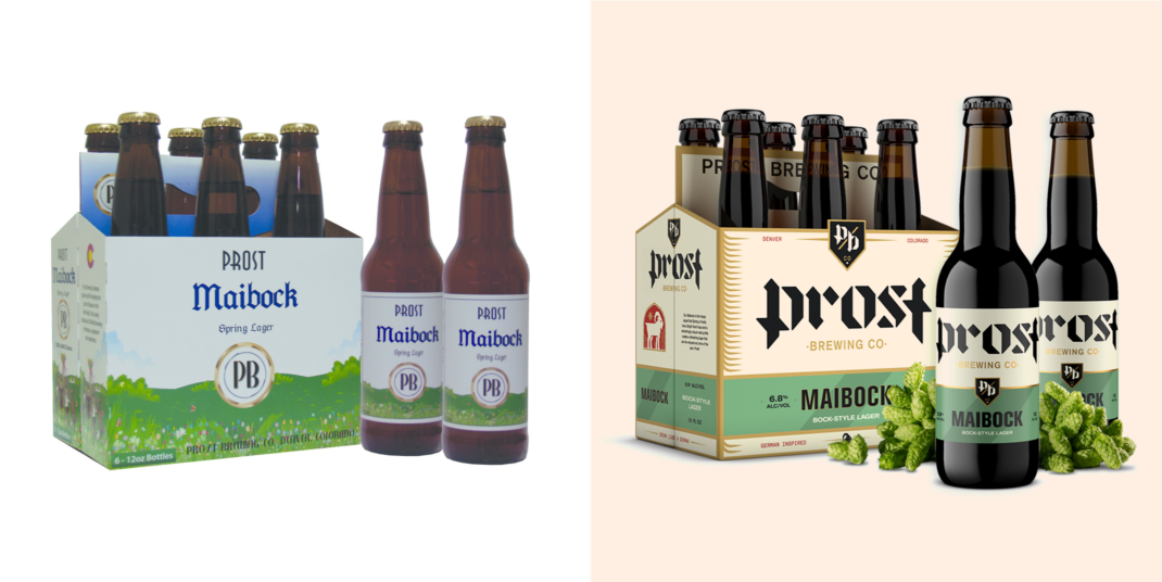
Prost Brewing (Denver, Colorado) represents a full rebrand. After only five years of business, they were considered part of the Old Guard in the fast-moving Denver beer scene. We updated their positioning, messaging and brand essence en route to developing an entirely new brand identity, packaging and website to tell the story of a premium German craft lager brewery. We will take a closer look at this case study later in this book.
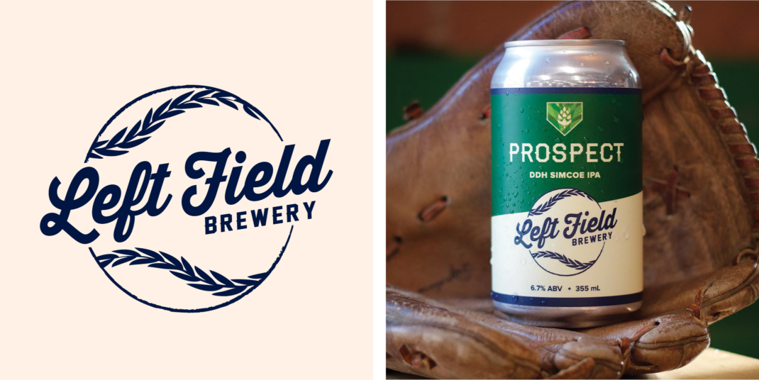
Left Field’s Previous Logo and Packaging
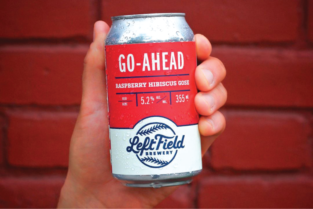
Left Field Brewery (Toronto, Ontario) came to us wanting to do some light Spring cleaning. They were already wildly popular in Toronto, but were dealing with a thinly-developed identity consisting of a logo and somewhat plain can designs. We subtly updated their logo and developed new cans (bottom image) to better tell their baseball-centric story. We’ll take a closer look at this case study later in the book as well.