It’s not uncommon for design to age poorly. (I’m wearing boot cut jeans while writing this. I get it.) If your brand identity was not professionally developed, or perhaps worse, was done in a superficial, trendy manner, the design (and your overall look) can begin to show its age quickly. And if you’re a brewery that’s growing and making some exciting moves, this can inhibit your progress. Just think of any one of the cool or cutting-edge companies that you follow—do they have bad branding? I’d bet a case of beer that they don’t.
When (and When Not) to Rebrand

02
When (and When Not) to Rebrand
Sometimes, the need for a rebrand can be obvious and feel very pressing. Other times, it can be more subtle. While there’s no set-in-stone checklist for knowing when you need to rebrand, we do see a recurring set of criteria leading up to breweries pulling the trigger. Here are a few of those reasons.
Your overall look is dated and doesn’t reflect your core values
You're making major changes within your company
You’re no longer the small outfit you once were. Perhaps you’ve brought in a new head brewer. Maybe you’re planning to start canning that taproom favorite NEIPA and want to make it stand out on shelf (but are worried it will clash with the rest of your packaging). Or, you could be ready to transition from bottles to cans. These and other major changes, including repositioning, or renaming your brewery (or beers), or shifting your portfolio, can fall flat without a solid and unified brand to support them.
New competition is leaving you in the dust
We see this with a lot of older breweries. High-energy startups will open in the same region and often position themselves against the established “Old Guard.” (Those jerks!) These upstarts dilute your market. And their impact is exacerbated by the natural tendency among craft beer drinkers to overlook their old standbys in favor of trying the latest and greatest beer. Simply put, people are thinking about you less and less.
You’re expanding into new markets and are facing stauncher competition
Breweries that are crushing it all over the country have solid branding and amazing beer. If you’re expanding into new markets, it’s only a matter of time until you clash with such a brewery. And this works both ways—big-time breweries can bring the fight to your backyard too.
Your website isn’t responsive and hasn’t kept up with the needs of your business
Your website needs to be responsive (work seamlessly from a desktop down to a phone) and has to be easy for your team to update internally, without having to fuss with code. If people can’t navigate your site on their phones and instead have to go to Twitter to see what’s on tap, you’re losing business to another brewery who offers their customers a friction-free mobile experience. And, if you’re doing tons of busy work— fielding donation requests, private event inquiries, mailing out gift cards—you’re spending time on the wrong things. A purpose-built, responsive website can solve all these problems, freeing you up to do what you do best—brewing great beer.
You feel like you’re always reinventing the wheel
We’ve heard several breweries say it feels like they’re starting from scratch every time they name a beer or release a new SKU. They don’t know what logo to use or what colors or illustration style to go for, and it’s exhausting. Preparing for the launch of what should be a fun and exciting new product quickly becomes overwhelming. A rebrand can cure this headache by clearly defining your visual rules so you can kick out new beers as needed without breaking your back.
You’re self-conscious of your branding and packaging
This one is hard to measure, but we’ve heard it many times, either sheepishly mentioned in a meeting or implied, as we begin working to understand our clients’ needs. Sometimes, you can read between the lines when you hear things like, “I hate wearing our shirts to festivals and conferences,” or “Our festival setup looks like shit compared to everyone else.” There’s no need to be shy about this. You care about what you do and should want to put your best foot forward. If you don’t feel like your brand is doing that for you now, maybe it’s time to make a change.
Here are three different breweries (different sizes and ages) from around the United States and Canada sharing in their own words why they decided to rebrand.
We had been Atlanta Brewing Co. in the past, and still legally were named that while doing business as Red Brick Brewing Co.
After a full staff changeover, Red Brick Brewing just didn’t resonate with us at all. It seemed silly to have Atlanta Brewing Co. and not use it. Also, with a resurgence in hyper-local pride, we felt that the original name had to be used. Red Brick didn’t mean anything to anyone, Atlanta Brewing Co. allows you to tell the story of the oldest brewery in the state and our local fans to feel more of a connection with the brand.
Cameron Davis, Marketing Director / Atlanta Brewing Co.Atlanta, Georgia
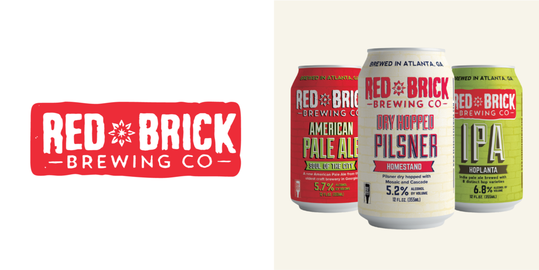
Red Brick Brewing’s (now known as Atlanta Brewing Co.) previous logo and packaging.
After six years, we decided it was time to make some upgrades to our brand. As we looked around the brewery, everything had evolved and grown so much over the years since our start-up phase.
Our beer was light years ahead of where we were when we started. We had created, improved and overhauled nearly every tool, vehicle, process and system across the business, and both ourselves and our team had grown and developed professionally in so many ways. We were a completely different business with a much bigger audience and customer base. We were no longer feeling that our branding fully reflected the brewery we had become.
We had developed our initial branding in the same way you might expect, on a shoestring budget with the help of some friends and colleagues. As we looked around, we knew it was time to invest in bringing our branding back in line with where the brewery had evolved to over the years. We also recognized that we had to keep pace on the shelf with our packaging as the number of competitive brands was growing, and craft brewery branding was getting better overall.
Continuous improvement is part of who we are as a brewery and while our brand had been working hard for us, it wasn’t getting the love it deserved for some time. The logo didn’t stand-out anymore, it wasn’t strong or confident in the same way the brewery had grown into it’s own skin. Symmetry was a challenge from a visual design perspective and most of all, the packaging wasn’t giving us the opportunity to tell the deep, meaningful stories from our beer names.
We knew it was time to start tweaking and refining what wasn’t working for us with the branding and packaging while holding on to the visual identity and brand equity that had gotten us to where we were. That’s when we approached CODO for help.
Mandie Murphy, Co-founder / Left Field BreweryToronto, Ontario
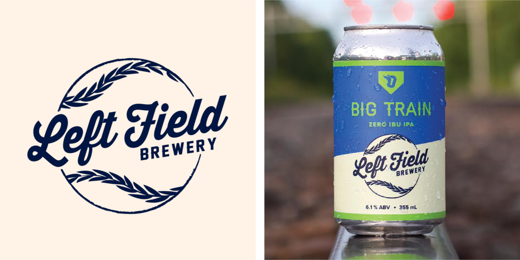
Left Field’s previous logo and packaging.
We started working with a consultant in 2017, and one of their first recommendations was to redesign our packaging. As we reflected on it, we realized we hadn't had a graphics update in about ten years.
And A LOT had changed in this time—we were the first brewery in Montana to package its beer in cans, and among the first handful of breweries to do so nationally. The craft landscape had become much more competitive and while our existing customer base was aging, new customers are aging INTO the craft demographic every day.
Additionally, throughout the past ten years, we’d had a number of different artists design our different labels. We felt our brand was starting not just to drift, but be chaotically redesigned without an intention to do so. We also had some other particular issues like inconsistencies among each package—the logo in the upper right on this package and in the upper left on that package, for example. Another interesting phenomenon that we were running into had to do with our flagship beer, Cold Smoke Scotch Ale. Our sales team was letting us know that when they would make a sales call and introduce themselves as being from KettleHouse Brewing Co., they would get a blank stare. But when they clarified they were from ‘the Cold Smoke brewery’, they heard, ‘Oh yeah! Awesome!’
Suzy Rizza, Co-founder / KettleHouse BrewingMissoula, Montana
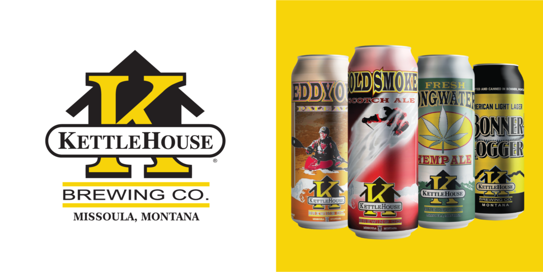
KettleHouse’s previous logo and packaging.
When not to rebrand
Whether subtle or overt, a rebrand signifies a change to your fans. If you’re updating your look in an attempt to move away from a negative reputation (PR disaster, quality control issues, etc.) without making core internal changes, your rebrand will fail. People are too smart to fall for this. Newly designed packaging may grab someone’s attention in a grocery store, but if that beer isn’t great or if you’re still a shitty company, you’ll lose the chance for repeat business.
Unless you already have a solid foundation to build upon (great beer and strong leadership, live by your core values, deep community involvement, etc.), attempting to rebrand is akin to putting lipstick on a pig. Put another way, a great logo can’t make a bad beer taste better (or a poorly run business more viable).