Are you completely reshaping your brewery’s culture and positioning? Are we throwing your logo out with the bathwater and creating wholesale visual change across the board? Or, are we building on decades of work and hard earned goodwill to make subtle updates in a natural progression? Would it be a misstep to jettison the visual signifiers and concepts behind the company as it stands? Or, does it make more sense to build upon, hone and enhance what already exists?
Evolution vs. Revolution

10
Evolution vs. Revolution
The most common concern we hear heading into brewery rebranding projects is the potential for confusing customers and losing business. “If we change our logo or packaging (let alone, our name), how will people know what to look for on shelf?” This is a valid concern, and one that we frame as “Evolution vs. Revolution.”
Evolution
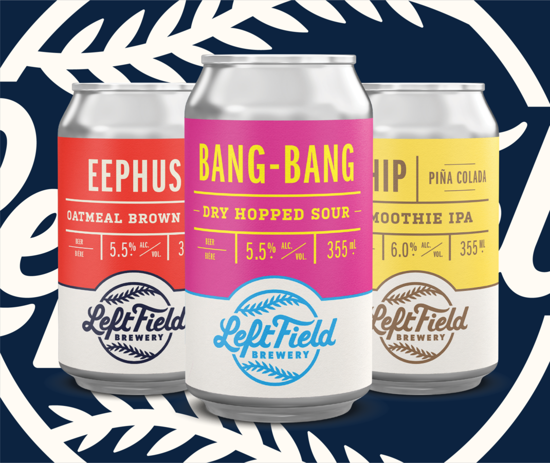
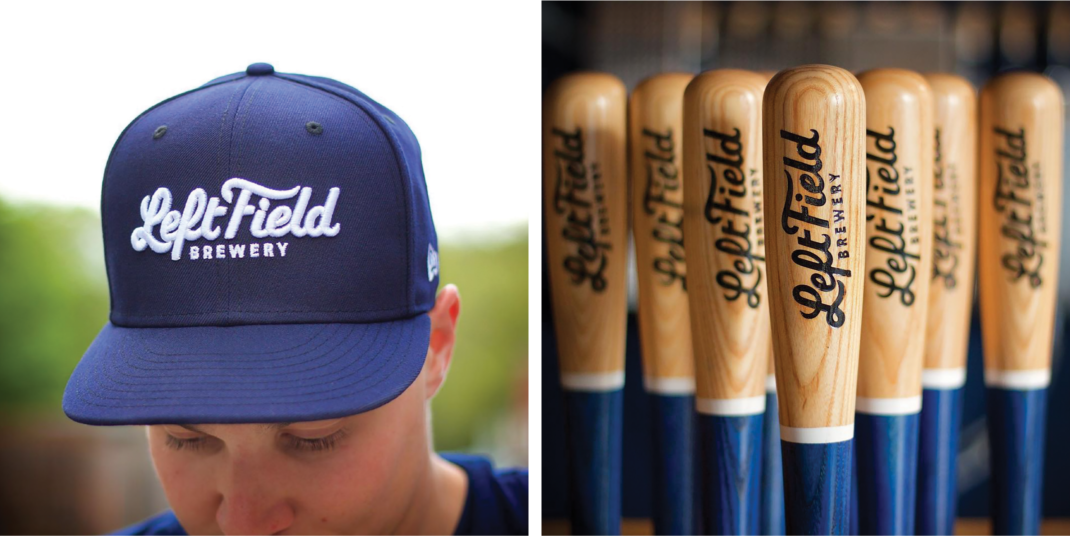
Left Field Brewery (Toronto, Ontario) is one of Toronto’s most popular breweries. While their story and positioning were rock solid, they were dealing with a thinly developed identity consisting of a logo and lackluster can designs.
We worked with their team to dive into Left Field’s history and build on what was already working. This work culminated in a subtle update to their core logo (top of page 74) en route to building out a robust secondary icon system (geared for their merch program) and a new packaging template system (opposite page) that they can update in-house.
Revolution
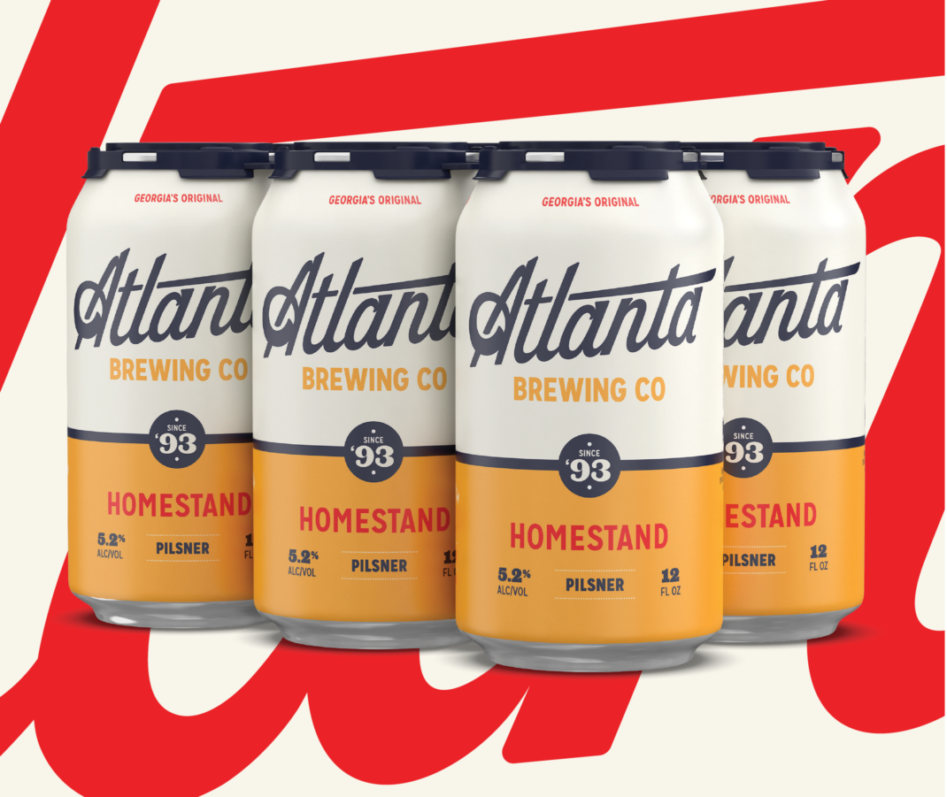
Atlanta Brewing (formerly, Red Brick Brewing) was looking to breathe new life into its brand ahead of its 25th anniversary. Like many older breweries, they had spent the better part of the last decade getting squeezed from both ends of the market; new breweries were stealing away off-premise sales and general excitement while Big Beer was driving down prices through its vast distribution network.
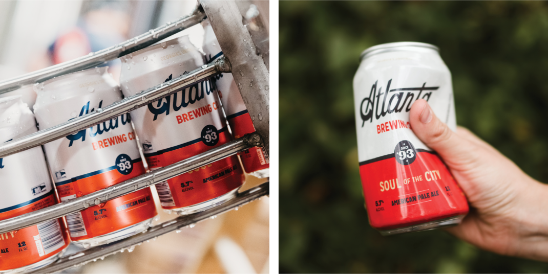
We worked with the Atlanta Brewing team on a sweeping renaming, rebranding and repositioning overhaul that helped the brewery tell the compelling story of Georgia’s oldest brewery—one that has weathered recessions, an eminent domain-forced brewery relocation, the craft beer boom, and a rapidly changing cityscape. This played out over an updated brand identity system, packaging, merch and website.
This rebrand led to a 26.6% increase in core beer sales and a 113.9% jump in merch sales YOY and is continuing to trend up as more customers become aware of the change.
Brand Equity: What stays, what goes
Brand Equity is the total amount of goodwill your brand has with its customers. On the big corporate side of the house (think Big Beer and global consumer brands), you’re measuring things like:
- total consumer mindshare (how many people, out of a group, are aware of your brand’s existence)
- how likely those same customers are to pick your brand over a similarly positioned offering
- your financial standing (your total market share, ability to command higher prices, and the potential for lifetime growth)
When rebranding a craft brewery, we’re more concerned with defining your visual and reputational brand equity—the lore and visual cues that if lost through the new design work, would confuse customers and lead to lost sales.
We define this equity by kicking off with a thorough brand audit.