19
Brand Voice, Personality and Essence
Your brand voice is how you consistently communicate your values and personality through words, no matter the channel or audience. To begin framing this, you need to get a sense of where people will come in contact with your brand and let the medium itself drive how you deliver your messaging.
A blog, for example, can be an intimate place to share long form writing and videos to give people a look inside your business. Instagram, on the other hand, can be a quick way to show the faces and daily goings-on behind the scenes at your brewery.
Common touch points between you and your customers include:
- Packaging and print materials
- Social media (Instagram, Facebook, Twitter, Untappd, etc.)
- Your website and blog
- Tap handles
- Merch
- Menus
- Vehicles
- Off-premise point of sale (posters, shelf talkers, etc.)
- Brewery wayshowing and signage
- Festival kit (tent, table skirt, jockey box, etc.)
List out all the of your communication touch points, and take some time to define who you’ll specifically be talking to at each place. Who’s your audience, and what role do you play in their lives? This process starts with your customers and can extend to distributors and other accounts.
Finding the right personality for your brand
One of the best ways to frame your brand personality is to think about the following question: If your company were a person, what sort of personality traits would it have? It doesn’t have to be a specific person, though sometimes it can be (think Sam Calagione, Tina Fey, or maybe Charles Bronson???).
One of our favorite examples is Big Lug Canteen (Indianapolis, Indiana). Craft Beer can be a sanctimonious industry with overly serious men crafting beer in dark brewpubs. But Big Lug? They make fun of themselves. A lot. If you swing by their brewery, you’ll see irreverent words like “decent” and “alright” to describe their beer and food along with their tagline, “Stoner food for beer drinkers.” This approach is realized across social media as they share and even promote negative Untappd reviews (they were doing this long before it was cool).
Here are a few voices you might want to explore:
irreverent / serious / counter cultural / lifestyle-oriented (such as outdoorsy, tech-focused, foodie) / proud / hopeful / sentimental
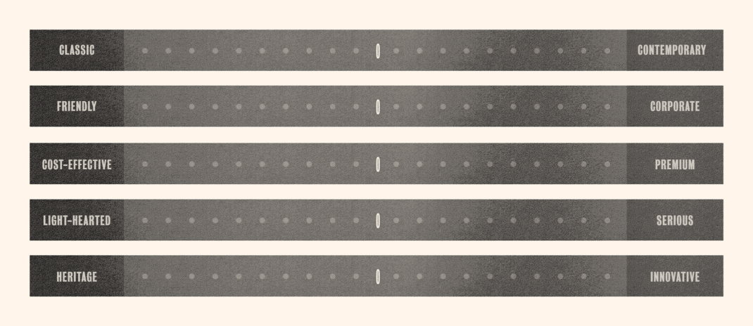
Here’s a preview of the “Spectrum Exercise” you’ll be completing in the workbook. By having your team select where on these spectrums they think your brewery falls (or should fall), you can get a better grasp on your brand’s personality.
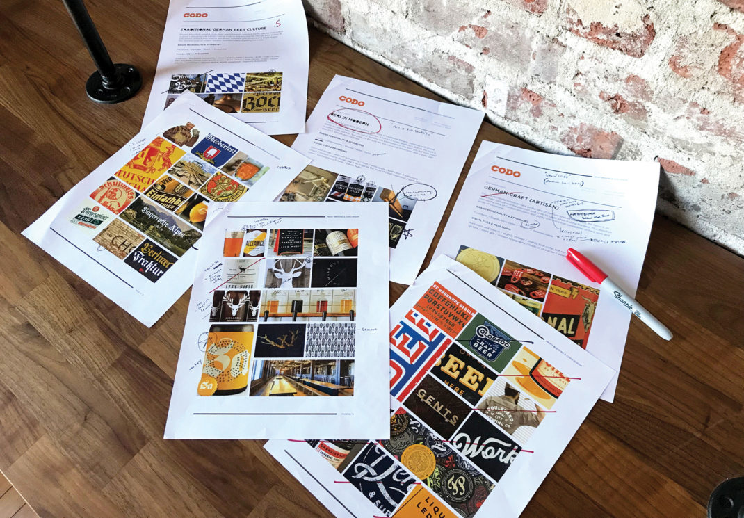
Some of the art direction and brand strategy work we developed with Prost Brewing.
Do some visual homework
A fun part of this process, and one that you may have started long before deciding to pull the trigger on your rebrand, is to gather visual art direction. Your goal is to gather visual inspiration—logo design, packaging, print, web and taproom design that you think has the same feel you’re envisioning for your brewery’s rebrand. This will help to orient your creative team as they move through their process.
We’ve found Pinterest to be a great tool for this process, both for visual research and for sharing mood boards. If you don’t have (or don’t want) a Pinterest account, start gathering images into your preferred cloud storage (Dropbox, Google Drive, etc.) so you can share it with your design team.
Here are a few great sites to find visual inspiration:
- Brand New
- The Dieline
- World Packaging Design Society
- CODO Design’s annual craft beer branding trend reports
- Another great place to search is Pinterest itself. Head there and search for “beer branding” or “beer packaging” for example.
Brand Essence
Earlier, we defined your brand as your customers’ perception of your company, including your products and your culture. It’s their gut feeling about you that shapes how they positively, negatively, or perhaps worse, don’t regard you.
Your brand is your reputation. It’s an idea that lives inside people’s heads and comes into play when they’re making recommendations to friends, deciding where to go out for the evening, or—at the moment of truth—standing in front of a cooler packed with colorful and charismatic beer packaging all vying for their attention. So while we can’t jump directly into peoples’ heads to directly manipulate their ideas, we can shape your story and the way you tell it so that people will have an easier time figuring out what you stand for and why they should care. We do this by defining your brand essence.
Your brand essence is a distillation of the most compelling idea behind your brewery. It’s your Why and your mission, vision, values and positioning all wrapped up into a concise statement. It is mostly an internal tool used to capture the spirit of your brewery as opposed to a public-facing statement or tagline. Think of it as a way of driving every decision you make from the moment of its definition through the rebranding process. If we can get super-specific and granular on your messaging now, it will make all branding work downstream (the visual, graphic design portion) consistent and clear.
Some of our favorite brand essences we’ve developed include:
- “Stomping Grounds”
- “Red Barn Romanticism”
- “Wild Alaska”
- “Shot & a Beer”
- “Blue Collar Scientists”
Brand essence in action
Now let’s bring this all together—your positioning, core values, audience and voice—to develop your brand essence. You’ll be completing this activity in the workbook. For now, let’s look at the brand essence we built with Prost Brewing during their rebrand to give you an idea of how this works.
Prost’s brand essence, “Berlin Modern,” directly led us to marry a traditional German look and feel (with custom Blackletter typography, hints of gold and a beautiful makers mark) with the precise and confident aesthetics found in contemporary East Berlin.
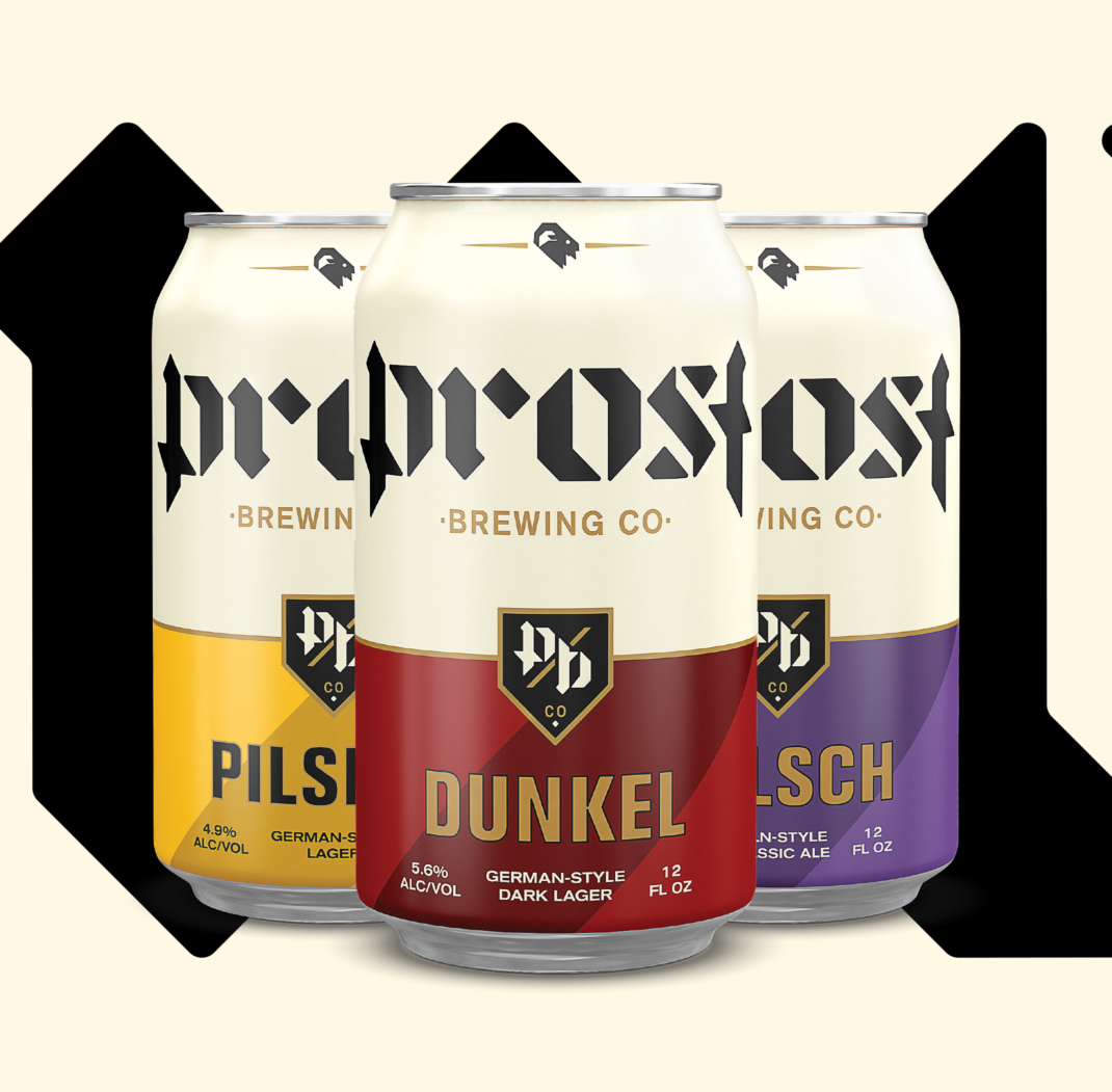
At only five years old, Prost Brewing is one of the most popular breweries in Colorado (their traditionally-brewed German beers regularly earn high international praise). As they geared up to launch the competitive California and Texas markets, they wanted to update their old branding to match their world-class German beer.
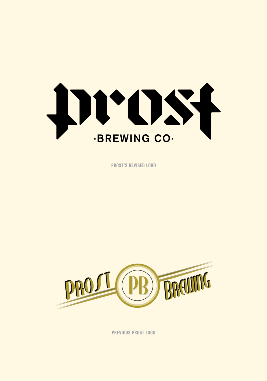
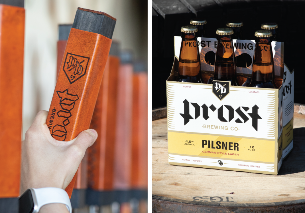
This kicked off a year long, whirlwind project that saw us updating their core identity and messaging, packaging (spanning several dozen bottles, cans and carriers), merch, sales material, environmental design and a fully-responsive website, all built from the ground up.
